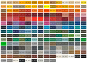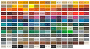

RAL Classic
The familiar industrial chart: broader hue families, straightforward code-led browsing, and the shades people usually mean when they say RAL.
Frequently opened colours
Yellow hues
A practical working run of yellows, from softer beige-leaning tones to strong high-visibility colours.
Orange hues
A tighter orange band with warmer industrial tones, signals, and stronger traffic-led shades.
Red hues
A compact red section with both muted coating colours and brighter signalling references.
Violet hues
A smaller violet family, useful when comparing the deeper, dustier, and more decorative purple-leaning tones.
Blue hues
A broad blue section for colder references, darker technical blues, and cleaner accent shades.
Green hues
A practical green group with muted, olive, and stronger engineered greens close together for comparison.
Grey hues
A working grey section where subtle shifts in darkness and temperature matter more than category labels.
Brown hues
Earthier browns gathered into one section for easier side-by-side browsing.
White and black hues
Neutral references gathered together for quick comparison of clean whites, off-whites, greys, and blacks.